With the goal of a fresh take on team merchandise, original artwork including logos and illustration were developed for a streetwear inspired collection. Product images coming soon…
Illustration, Clothing Design - Seth Book
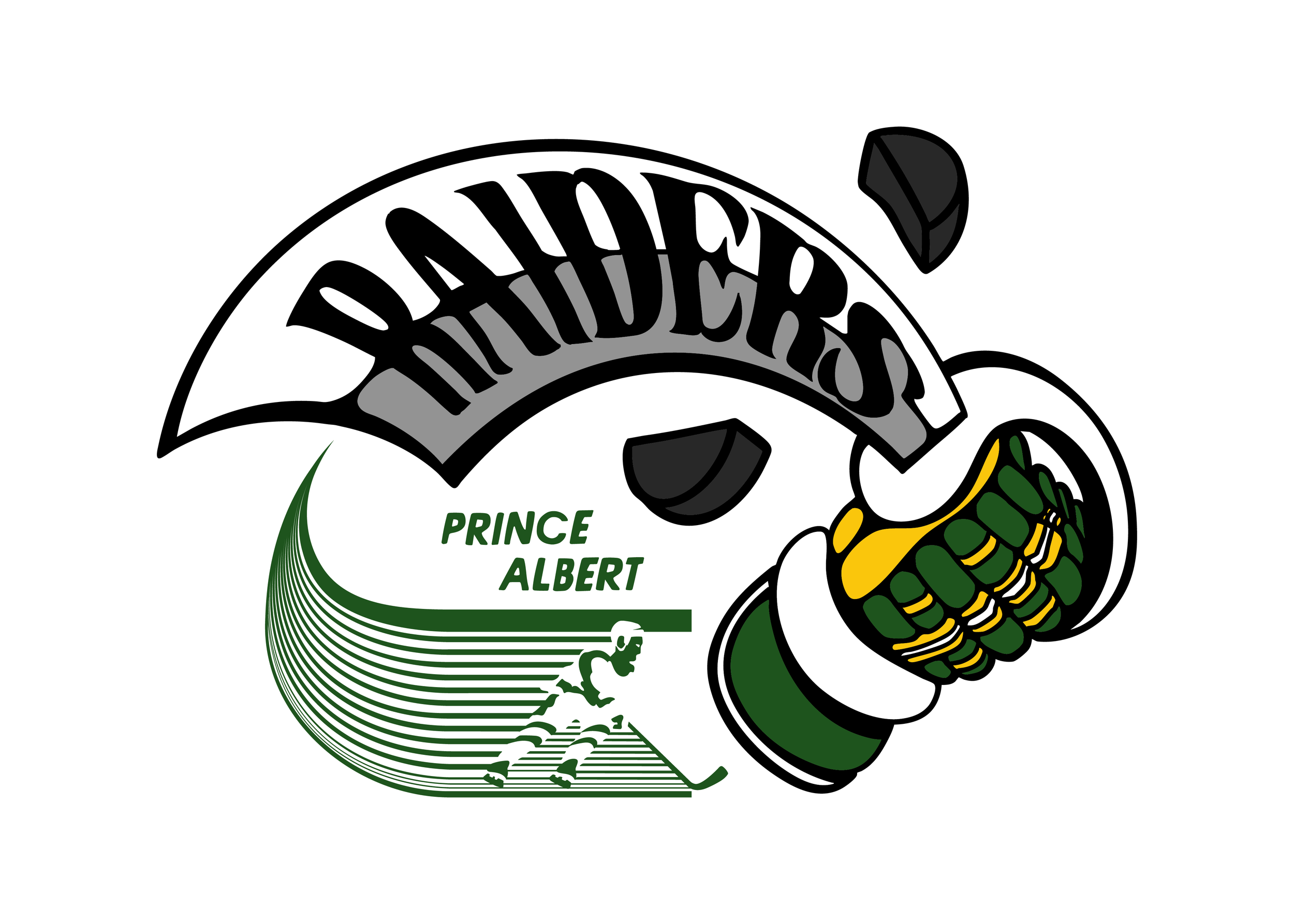
Prince Albert Raiders
-
Illustration
Clothing Design
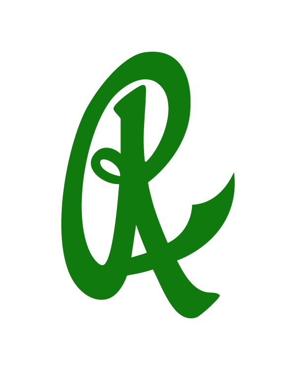
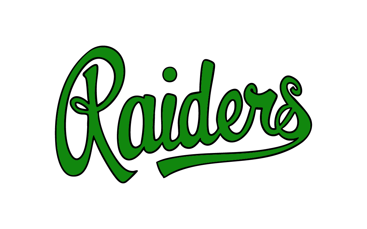
Inspired by the original Raiders script wordmark logo from the 1980’s, the PAR icon was developed as a minimal baseball-style monogram for the first cap of the collection.
The original R features a Raider sword slashing through to reveal an A.
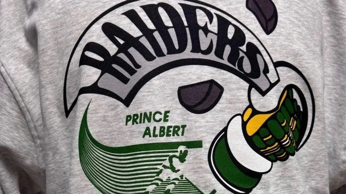
Vintage hockey merchandise used to feature exaggerated imagery and objects like flaming pucks, broken sticks, and chaos on ice. Time to bring that back.
Utilizing a fresh take on the original club logo, the crewneck illustration features a skater with speed lines as the wake of a sword slicing through a puck.
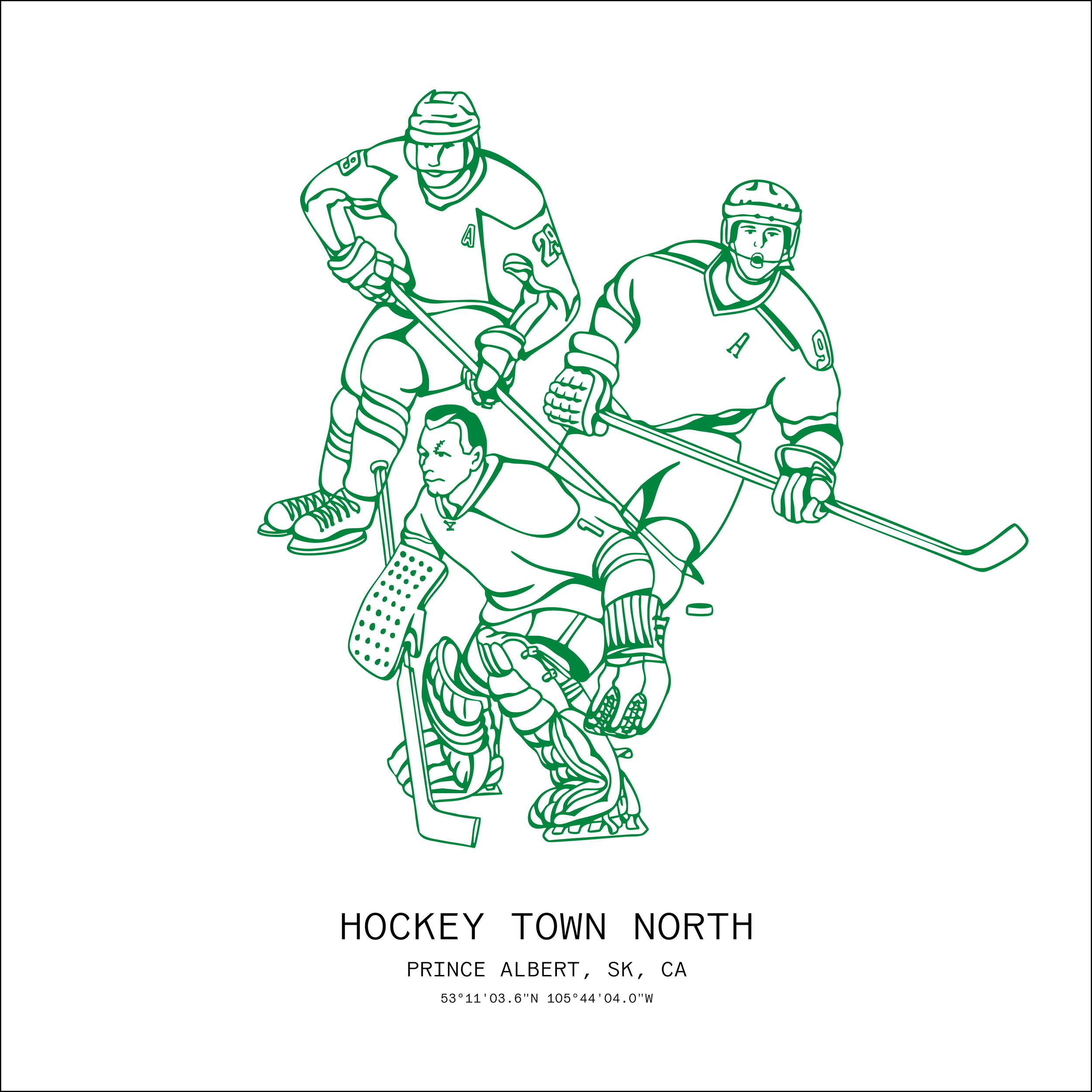
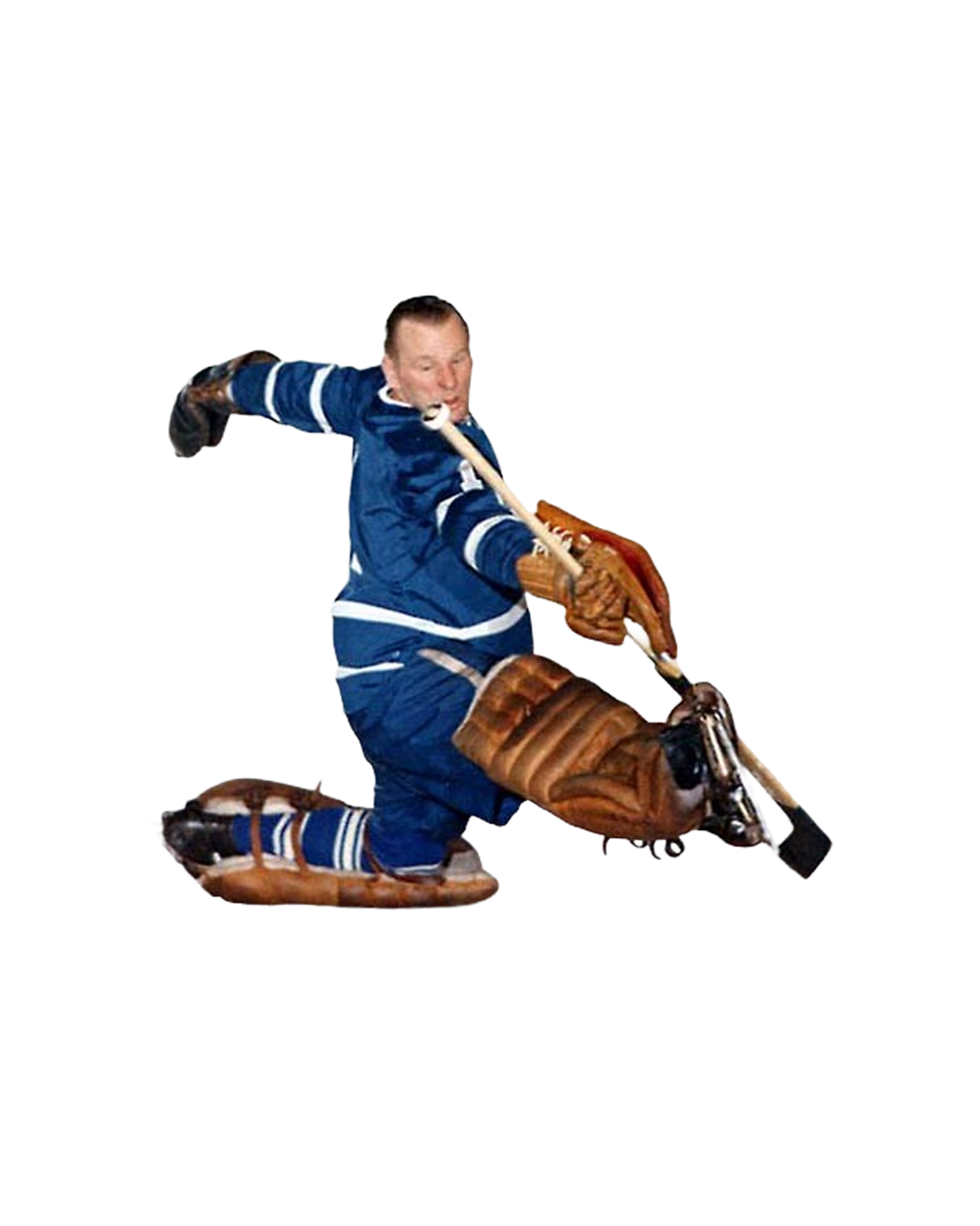
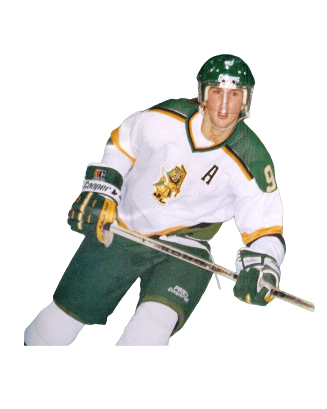
Legends have skated through Prince Albert. Leon Draisaitl, Mike Modano, and Johnny Bower come together to illustrate the generations of Hockey Town North.
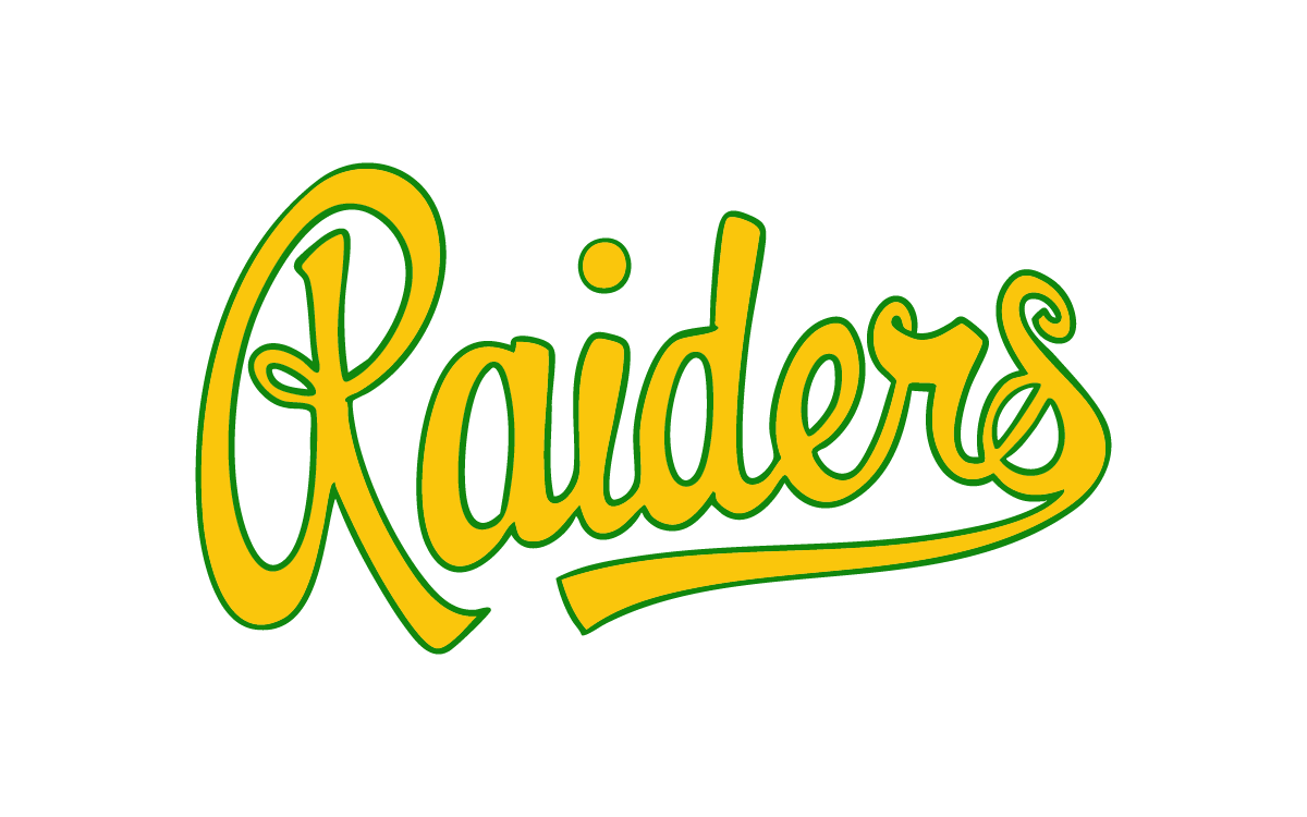
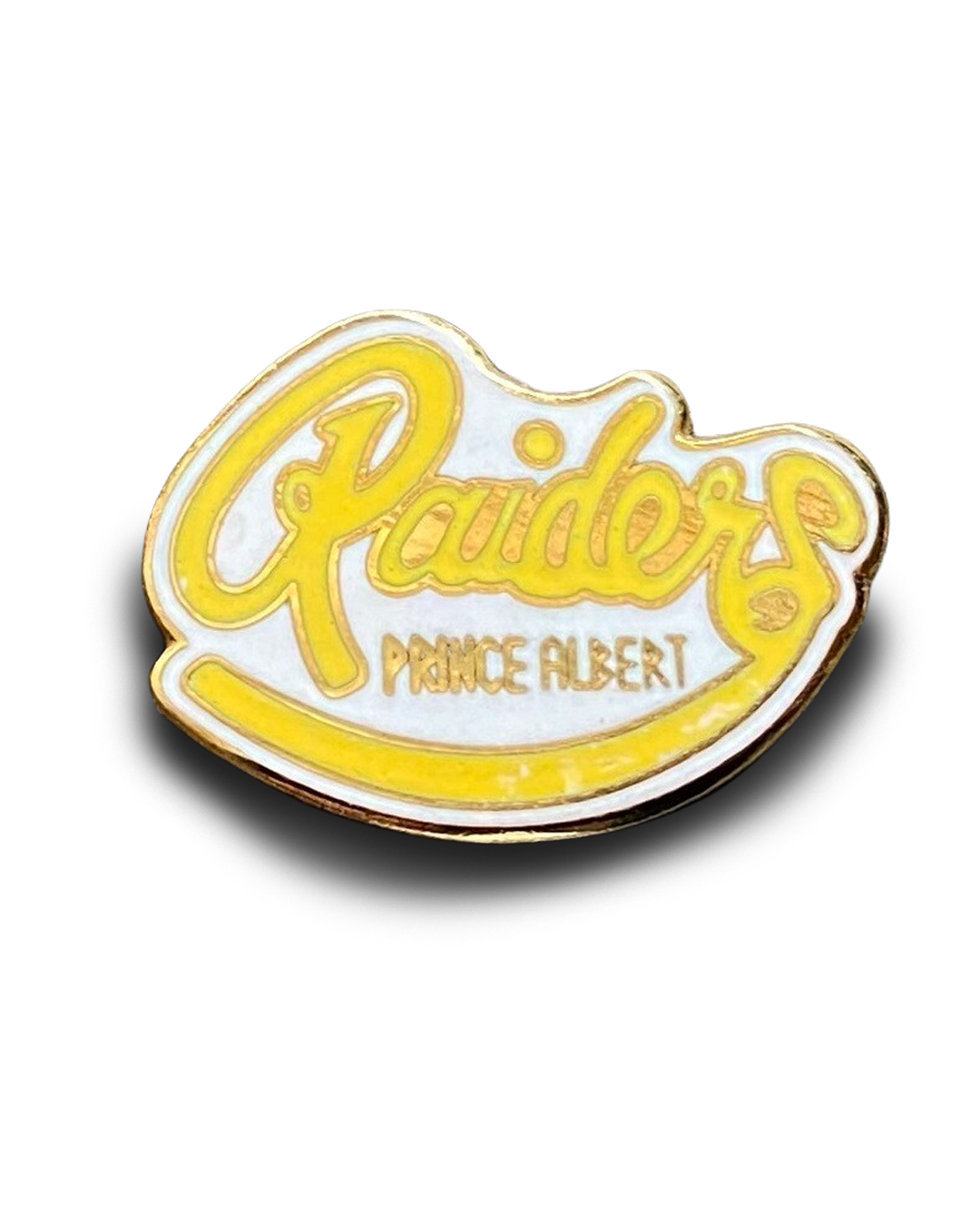
The classic Raiders script is rewritten for a minimalist jacket embroidery.
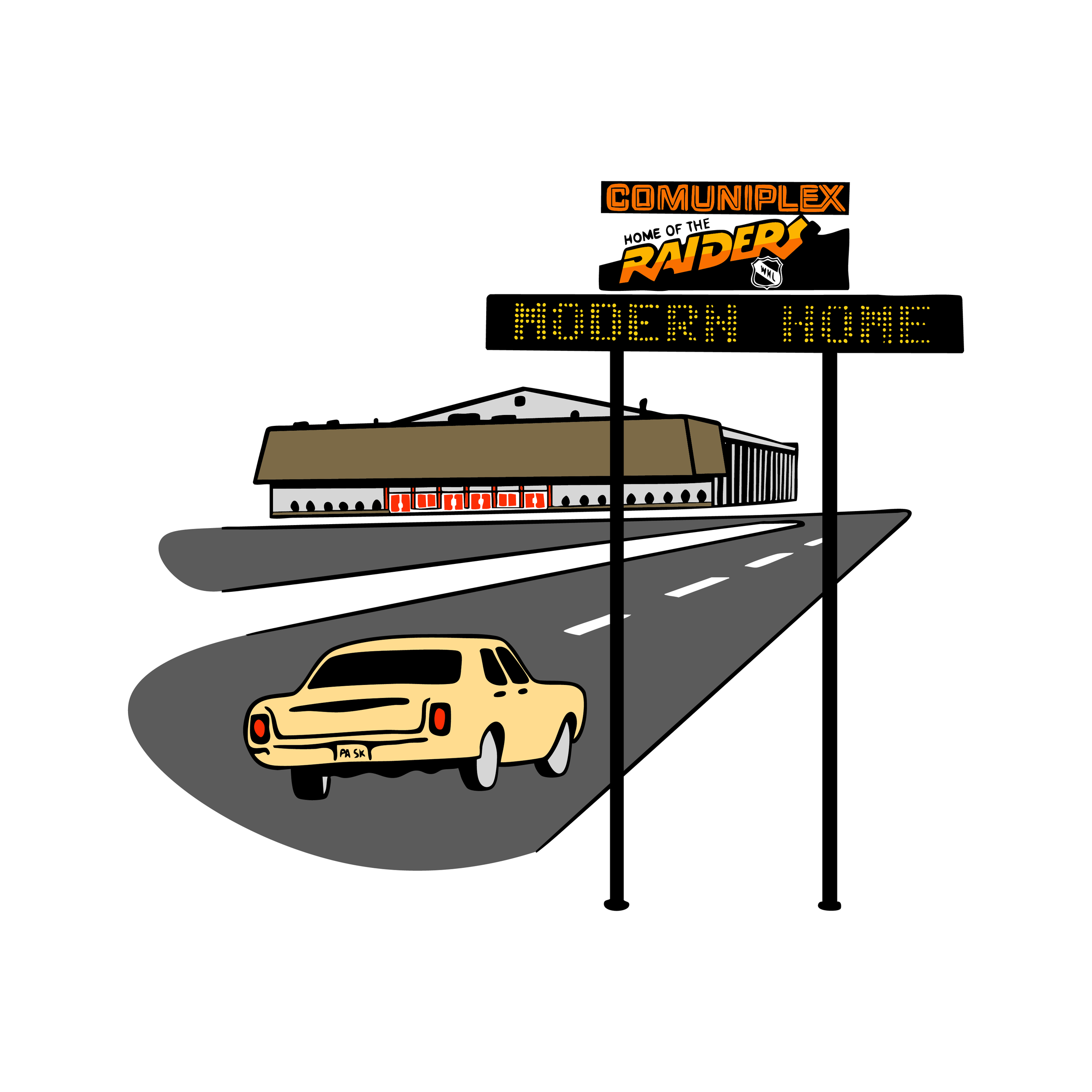
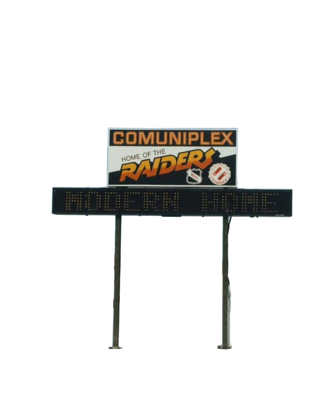
Before Art Hauser Centre, the Comuniplex was the modern home of the Raiders.